Documentation Index
Fetch the complete documentation index at: https://help.cryptolens.io/llms.txt
Use this file to discover all available pages before exploring further.
Introduction
There are several data sources you can use to analyse the usage of your application and generate audit reports. We will describe them in more detail below and provide several examples of how they can be analysed.Data sources
- Web API Log - contains a list events that are created each time a license changes (eg. activation or change of expiration date). Data object changes are also logged in this log. Note, this log contains minimal information about the event.
- Events Log - contains events that were registered using Register Event as well several other internal events.
- Object Log - contains a list of events that are created when certain object types are added or modified to allow you to track all changes made by you and your team members.
Analysis
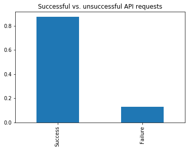
We suggest to review the following repository to check if the report that you need to create is already available. As always, please let us know should you have any questions at [email protected]. The easiest way to analyse the logs is using our Python SDK in combination with Anaconda to manage the packages. Let’s look at how we can get some basics stats on the ratio of successful vs. unsuccessful requests. First, we need to load the relevant data: